Dorga Frutta - Logo design
|
Menu |
|
|
ITA ENG |

|
|
Transparency
ITA | ENG |


"In good times, people want to advertise; in bad times, they have to."Bruce Barton
"In good times, people want to advertise; in bad times, they have to."
Bruce Barton
 Back
BackDorga Frutta - Logo design
CATEGORY: Graphics
YEAR: 2022
Logo design for a shop of fruit, vegetables, honey and other typical products.
Dorga Frutta is a historic shop in the upper Seriana valley, in the center of Dorga in Castione della Presolana. The shop, passed from father to son, has always offered excellent products to the inhabitants of the area but has never had a real logo.With the advent of the new management, the store has been renovated in the interior (always relying on our Studio) and has strongly felt the need to identify itself in a brand, a strong sign, with a fresh design, which was able to distinguish the new generation of Dorga Frutta.
Dorga Frutta is a historic shop in the upper Seriana valley, in the center of Dorga in Castione della Presolana. The shop, passed from father to son, has always offered excellent products to the inhabitants of the area but has never had a real logo.With the advent of the new management, the store has been renovated in the interior (always relying on our Studio) and has strongly felt the need to identify itself in a brand, a strong sign, with a fresh design, which was able to distinguish the new generation of Dorga Frutta.
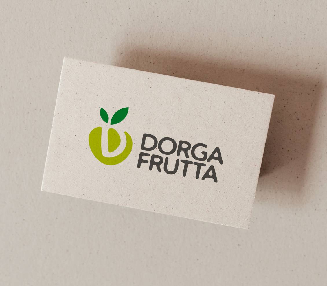
After several sketches, the pictogram of a fruit was born which incorporates a soft letter "D". The graphic sign is deliberately graceful to recall the world of vegetables and fruits in general, always characterized by sinuous and curvilinear shapes.
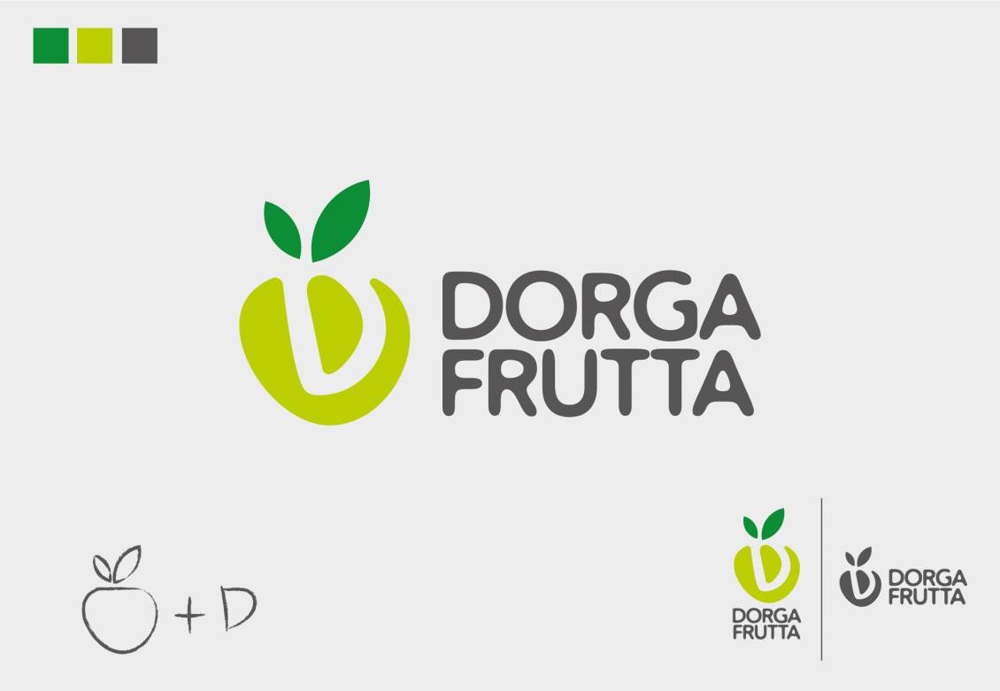
The choice of green, a fresh and youthful color, was born from the ability of this color to communicate growth and rebirth, as well as being the color that identifies nature par excellence.
Do you like the way we worked?
Make an appointment for a non-binding consultation now.
Schedule your consultation now!
Dorga Frutta - Logo design
CATEGORY: Graphics
YEAR: 2022
YEAR: 2022
Logo design for a shop of fruit, vegetables, honey and other typical products.
Dorga Frutta is a historic shop in the upper Seriana valley, in the center of Dorga in Castione della Presolana. The shop, passed from father to son, has always offered excellent products to the inhabitants of the area but has never had a real logo.
With the advent of the new management, the store has been renovated in the interior (always relying on our Studio) and has strongly felt the need to identify itself in a brand, a strong sign, with a fresh design, which was able to distinguish the new generation of Dorga Frutta.
After several sketches, the pictogram of a fruit was born which incorporates a soft letter "D". The graphic sign is deliberately graceful to recall the world of vegetables and fruits in general, always characterized by sinuous and curvilinear shapes.
The choice of green, a fresh and youthful color, was born from the ability of this color to communicate growth and rebirth, as well as being the color that identifies nature par excellence.
OTHER PROJECTS FOR THIS CLIENT

 |
 |

|
Change your cookies preferences |
| Active cookies settings: |
| · Essential cookies: |

|
| · Analytic cookies of third parties with anonimous IP: |
|
| · Profiling cookies of third parties: |

|
Active cookies settings:
| · Essential cookies: |
|
| · Analytic cookies of third parties with anonimous IP: |
|
| · Profiling cookies of third parties: |
|
Use of the cookies
|
||||||
|
||||||
| Only technical cookies |

|
| Accept all cookies |

|
|
|
|
| Cancel change |
|
| Confirm change |
|
| Accept selected |
|
| Close choice options |

|
| Choice options |
|